Compiled by SB Anderson
The Veteran’s Administration has a mountainous backlog of disability claims waiting to be processed and concedes it probably won’t make much headway until 2015 at least in reducing it. This is a significant story, of course, for these veterans, their families, and the communities in which they live.
We’ve assembled a selection of resources to help you cover this issue on a local, regional or national basis. Much of what we present comes from the staff over at the Center for Investigative Reporting, which has done yoeman’s work staying on top of this issue, along with gathering a pile of data and creating a pile of code that makes it all broadly available.
Below is a weekly graphic we do based on our database of VA processing data. You can find out stories on the data, as well as a weekly chart on progress, at On the Beat.
Below is an interactive map that is updated weekly. It gives stats for the 48 regional VA processing centers, as well as nationwide.
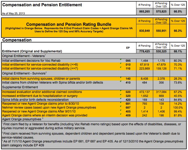
The Veteran’s Administration produces “Monday Morning Workload Reports” each week that recap the state of all types of claims processing at the local processing centers, with roll-ups by major region of the country, and nationally. These are among the reports that CIR uses for its map. They are not for the squeamish, as they are a bit dense with jargon and come via Excel spreadsheets. If you’re adventurous and want to explore all the way back to 2004, give them a go. At right is part of the report for the May 25 update.
If you really want to get into the details on what progress the VA is making, visit the VA’s “Aspire” dashboard, which shows in monthly detail “progress toward achieving the aspirational goals that (Veterans Benefits Administration) is striving to meet by 2015.
“The VBA Aspire Dashboard depicts how each of our VA regional offices (ROs) measures up to the aspirational goals we have set for quality and timeliness of claims processing. The Dashboard lists many performance measures and our goal for each measure. The data shows where we are’ in comparison to ‘where we aspire to be.’ ”
Like the Monday Morning Workload Reports, the data is available by local area, geographic region and nationally. Data goes back to May, 2012. You can export the tables as Excel files as well. And you can navigate to the data by a map.
Below are statistics for the VA processing centers that had the longest backlog as of the end of May. SEE THIS DASHBOARD for data and interactive charts on all cities with a VA processing center. Charts powered by the Center for Investigative Reporting.
The Iraq and Afghanistan Veterans of America

Other sources of data on veterans benefits:
And, more to come. This dashboard is a work in progress and will expand as we discover more great resources.